Kegworks Branding
Moving beyond barware and home brewing to a premium partner for custom architectural metalwork.
Creative Direction
Design
Execution
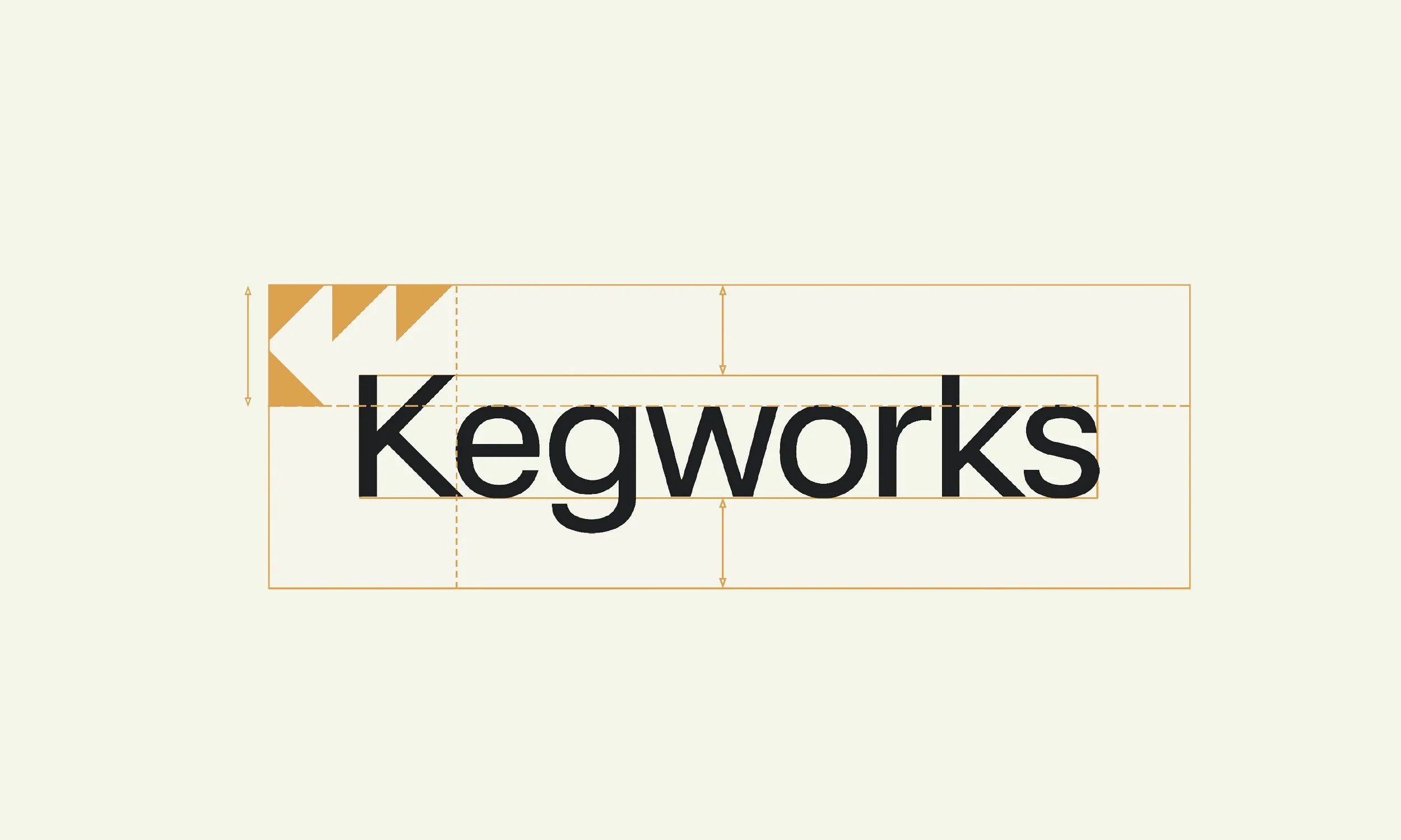
DETAIL:
Kegworks was at a pivotal moment in its evolution, moving beyond its roots in B2C bar supplies to embrace a new role in custom manufacturing. This transition called for a new identity that reflects Kegworks’ premium ambitions and growing capabilities—signaling to the market that they are now a solution-driven partner for exceptional architectural metalwork.
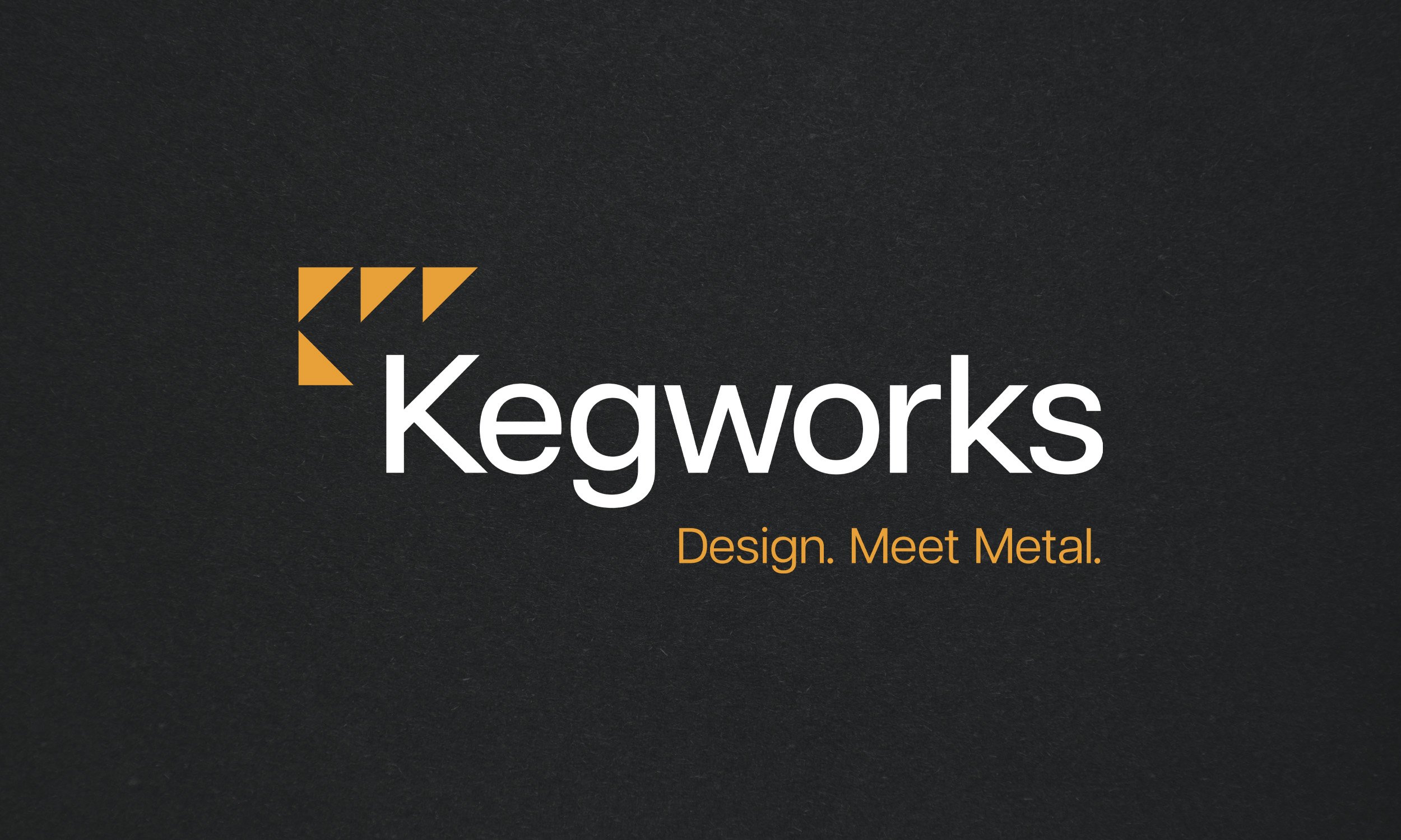
This shift opens new doors to a sophisticated audience: visionary architects and designers who need their bold ideas realized with craft and precison. The new logo reflects a commitment to sophisticated design and practical solutions for complex challenges. The abstract monogram of K and W—formed from triangles created in the negative space of the K—symbolizes precise problem-solving and a refined aesthetic. The triangle also represents fire—the alchemical symbol of transformation—reflecting the essential role of heat in metalwork.
Paired with a clean sans-serif typeface, the logo conveys strength, premium quality, and professionalism with understated elegance.
CREDITS:
Client: Kegworks
Agency: Truth Collective
Writer: Grant Gallagher

BEFORE

AFTER