Willow Domestic Violence Center Branding
Building a brand that welcomes all survivors—with empathy, strength, and resilience.
Design
Execution
DETAIL:
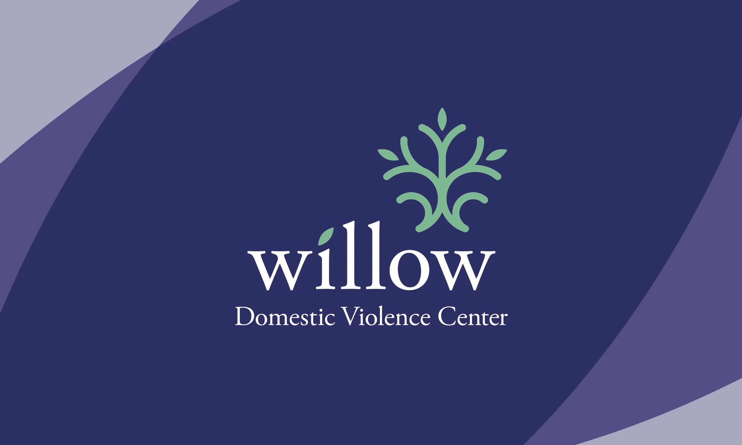
Formerly known as Alternatives for Battered Women, the center needed a new name and identity to better reflect the breadth of its services—and the diversity of the people it serves. The old name excluded survivors outside of those who identified as a women, and the word “battered” narrowly framed abuse as only physical.
We set out to create a brand that felt open, inclusive, and supportive of anyone impacted by relationship violence—across all genders and experiences.
The willow tree became the perfect foundation for this new identity. A universal symbol of resilience, adaptability, and protection, the willow bends without breaking—thriving in stormy conditions. Its sweeping branches provide refuge, while its presence radiates a calm, quiet strength—making it the perfect metaphor for a place that offers safety and support in life’s most turbulent moments.
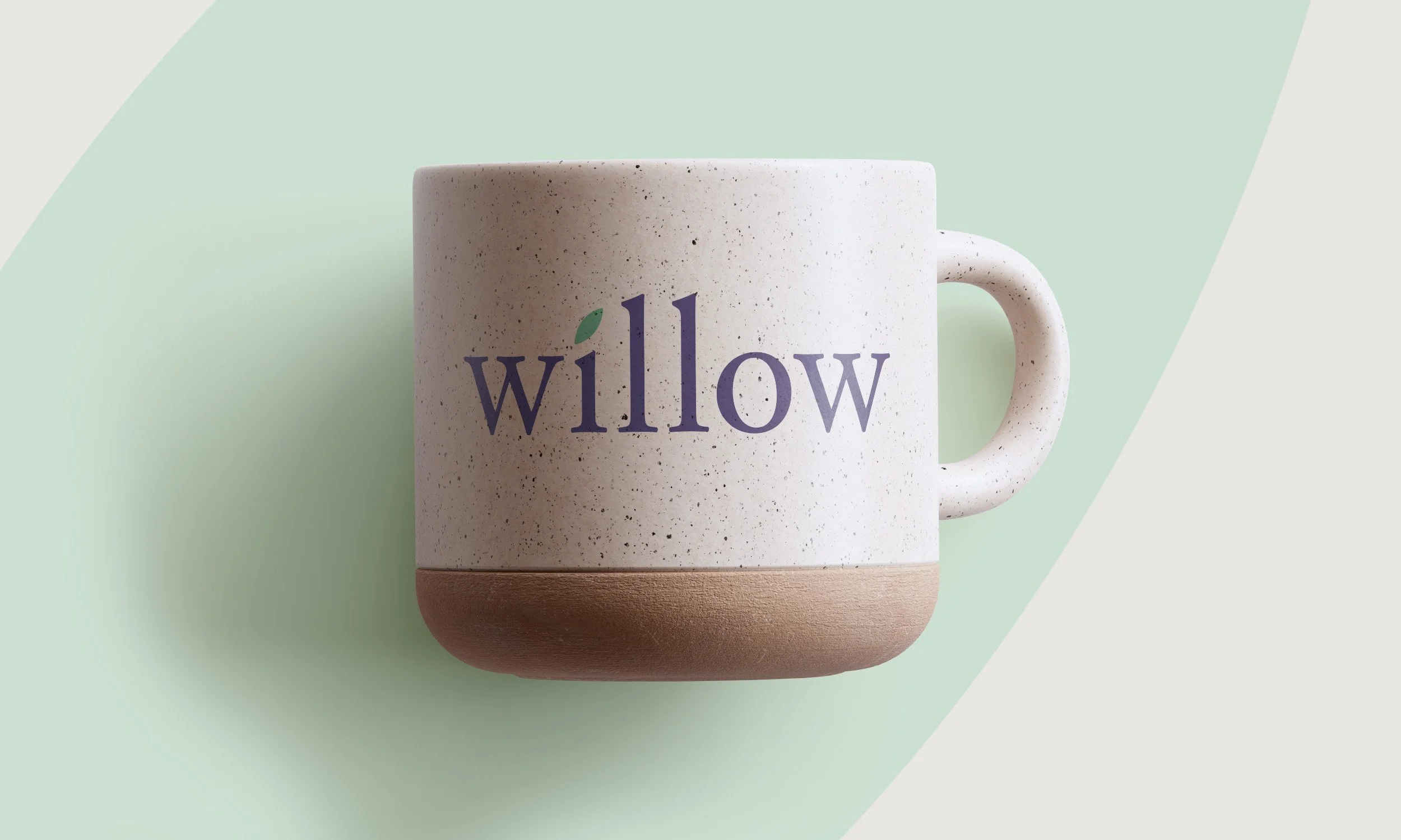
Visually, we brought this idea to life with a look and feel rooted in softness, simplicity, and care—reflecting the center’s commitment to healing and dignity.
CREDITS:
Client: Willow Center
Agency: Truth Collective
Writer: Kate Sonnick

BEFORE

AFTER


If you or someone you know is experiencing abuse, there is support. If you are in the Greater Rochester area, Willow can help.
24-Hour Hotline
(585) 222-SAFE (7233)
willowcenterny.org